
 The next quilt we come to is Leather Feathers. Yes it really is leather, and yes it really is a quilt. This quilt contains two layers of wadding. It was the first time I tried quilting leather and I was worried that one layer would be crushed flat by leather. Actually it isn't a problem with the really soft leathers I use. That being said, two waddings always make the quilting pop so perhaps it wasn't such a bad starting point. Quilting leather is on of the most nerve wracking things I've done. Knowing you can't unpick is really scary. It's a bit silly really given I don't actually have to unpick that much normally but that's just how it is for me.
 This quilt was one of the stars of the show. It will probably never stop surprising me the reaction this quilt gets. I guess it will always be stuck in my mind as a sample piece. I needed to try a few new ideas and this was where I did that. The quilt has a red batik backing, two layers of wool wadding and a cotton sateen top. The top fabric was a piece of Heide Stoll-Webber fabric that was waiting in my stash. I chose it because I wanted to explore the changing the shade of a fabric with thread. The mid grey seemed like a perfect starting point. Given how special the fabric is I made a design that would use every scrap of it. The fabric has no design on it. It is a hand dyed fabric with gentle variations of shade across it. A lot of people have thought the feathers were printed onto the fabric, but no, they are just the quilting.
I started at the top of the quilt by marking the depth of the top border and the diagonal lines through the corner. With the machine I have I couldn't sew the whole depth of the feather at once and rather than constantly roll the quilt back and forth each feather each was done in two parts.
 Once I had the top of a few feathers done I could start strengthening the lines around them. From there I could start on the background filler. The filler to the outside edge of the feathers was stitched in black thread. This darkens the fabric and helps the feathers to stand out. The pattern is the curls I use instead of a stipple but on this quilt they are tiny, the large curls are sometimes as bit as half an inch across.
The inner edge of the feathers was over sewn with cream thread instead of black. There are three or four lines of stitches all the way around the feathers. The cream thread was then used for the background stitching inside the feathers. The cream background stitching is micro pebbles. Yes it took a very long time. In the quilt there are four whole comes of thread, that will be around 12,000m of thread.

 The next design idea I wanted to test was changing a quilts colour at a quilting pattern. I was specifically interested in the idea of a border transitioning at a smaller curled border. I was pleased with this sample and this is used this technique in the full sized wholecloth that this was a sample for, Prometheus. Prometeus was too big to fit in this gallery but hopefully will be out and about on the show circuit this year. It will be at the National Quilt Championships at Sandown and I have entered it for Paduch this year. I won't hear for another couple of weeks whether it has managed to get in.
 Greek Fossils has only just arrived home. It has been on tour with the World Quilt Show. This is one of my favourite competitions to enter. I love that it goes to several different venues, but the best part is how they handle shipping the quilts. It is one of the cheapest shows to enter as the quilts are gathered at a hub within your country then shipped at the shows expense to America. Unfortunately they have size restrictions that mean a lot of my quilts aren't eligible to go. However any I have that fit the requirements will be entered.

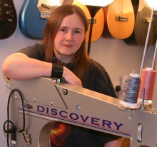
 While I was demonstrating the longarm in the gallery the most requested pattern was a design similar to the centre of this quilt. On an A4 piece that is quite tricky, but after a few failed attempts I managed something close enough to keep people happy. Obviously with the micro pebbling the took a lot longer than other samples, but that turned out to be a very good demonstration. People could not only see how long it takes but could also look over my shoulder and see how tricky it is to focus on a design this small. I didn't believe it the first time I heard a long arm quilter say she had to look through her hopping foot to see where she needed to stitch. For this pattern, that is exactly what you have to do, and after a while your eyes really don't like it.
However it turns out the colour of the thread shows up quite well even with less dense designs. To further reduce the stress on the leather this quilt only contains one layer of wadding. Combined with the more intricate design the quilting is still very well defined.
 If you own a copy of my book Ferreting Around you might want to take a good look at the cover. Not the cover picture as such, the background image. The blue area. Do you recognise it? It's this quilt. We needed some sort of texture for that part of the cover and Tet wanted me to just quilt up a bit of something. I was already up to my eyeballs in quilts I needed to do for a show so I didn't take this suggestion very well. At the time most of my wholecloths were too flat to give a good texture and I was starting to think I was going to have to make another quilt, when we had a moment of inspiration. This quilt filled the space perfectly.
 Bad Rain was very popular with children. They all seemed to like this style of art work. I find that quite unsurprising. However only a few thought it was scary, and if only from it's strangeness and size I would have expected a reasonable amount of scary.
Adults on the other hand tended not to like it on first look, but nearly all changed their mind after I explained it to them. Generally I like not having long explanations displayed with my work. I am quite happy for people to come up with their own story of the piece but for this one I think I will have to produce it a sign.
 I suppose it's quite fitting really. This images comes from a book called Cancertown. It was written by a friend Cy Dethan and the artwork was originally produced by Stephen Downey. You can see all of us with the quilt here. The image is designed to be encountered within a story. It helps to tell the story but also expects you to come to it knowing certain things about the the world it is showing you. If you want to know more about Cancertown, follow the link and Cy will tell you all about it.
Let me tell you something about trying to capture another artist work in a quilt. Given I don't draw myself working from other peoples art seems the simplest option. To a degree it is, but it turns out that in quilting I do put my own spin on the art work. That's fine until I really want to render exactly what the original artist had created.

 Working so closely with someone else's art really makes you look at it and I think there are a lot of details that people reading the book will never see, let alone appreciate. The Bad Mouths (the characters that are all mouth filling the sky) all have slightly different features and characters. I love the ones with their arms folded, especially the largest one diagonally up from the huge blue one.
 The blue Bad Mouth was mostly hidden in the book because it falls directly in the spine of the book. It's a real shame, it had great texture. I think it came out particularly well as a quilt. The lumpy muscle is perfect and becomes really 3D when quilted.
 Bad Rain is another quilt that hasn't done many quilt shows. It's too big to ship easily (it HAS to be rolled) so the US shows are out and even UK shows are difficult if I can't hand deliver it. On the other hand it has made it out to a few comics events and it has been very well received. I wasn't sure how people would react to it when we came up with the idea but it seemed daft not to try displaying it, if nothing else it is a huge advertising banner. I didn't need to worry. As it turns out comics events might be a very good place to introduce younger people to quilting. I supposed it's just another form of art and the people at these events are already interested in graphic novels so why not. Now I just need to fit another dozen hours in the day to follow that idea up...
 I got most of the fabric in place and then realised I had a problem, his earrings. Never mind, they are only small I can leave them off right? Wrong. I've known him too long they had to be there. In the enlargement you can probably see that not only are they pieces of fabric, each one is made of two pieces. Yes that is really far too small to sew through but it can be done if you are mad enough. It did require a piece of washaway stabiliser to keep it steady and I may have even bonded it in place. I can't remember for sure but it is one of the tricks I try on difficult pieces. I don't use Bondaweb though, way too stiff. I generally use Misty Fuse if I have to bond anything.
 I think I am calling that it for now. That's a lot of images and I am ready for bed. I will try and do another section tomorrow.
Part four is here.


2 comments:
That was a great tour..felt like I was there!
Thanks for sharing photos of this gorgeous grey quilt - it's one of my favourite of your whole cloth quilts. One of my friends said (why don't you make one of those?) My response was 'ha ha ha ha ha ha clunk) which was me laughing my head off.
cheers
cat
Post a Comment